
EW Design Tutorials
Web Design Color Schemes
Choosing a color scheme is very important. Color schemes are usually determined by a color wheel and one of these methods. Colors can also be associated with a mood or meaning. The western world considers white a pure, clean, virginal color. In the eastern world color can denote a funeral. The color scheme definitions below are mostly associated with western viewing audiences and are examples only. Choose your scheme with your potential viewer in mind.
Monochromatic – a monochromatic scheme is formed by starting from one color and making it lighter or darker by mixing white or black with the color, but not changing the hue. These are clean or elegant schemes that create a soothing and harmonious atmosphere. These are great for minimalist websites.
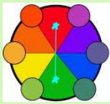
Analogous – an analogous scheme is formed by choosing 3 colors that are next to one another on the color wheel. These colors are found in nature. They are versatile, harmonious and pleasing to the eye.
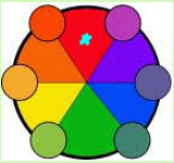
Complementary – a complementary scheme is formed by 2 colors at opposite ends of the color wheel. Complementary colors are vibrant (sometime too intense in the pure color form) are eye-catching and dramatic, but bad for text. Are best used in small amounts such a button or sign but not together. Secondary and tertiary complementary colors or the more muted tones are best when used to design a web page.
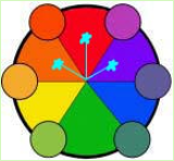
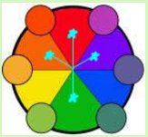
Triadic – a triadic scheme is formed by 3 colors equally distant from each other on the color wheel. Triadic schemes have color richness, are strong and visual while creating harmony. The triadic scheme in secondary and tertiary colors are best as the pure colors are quite jarring when side by side in a site.
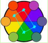
Tetradic – a tetradic scheme is formed by 4 colors in a visual rectantangle (4 corners) on the color wheel. This color scheme is somewhat hard to make a web site look harmonious when used.
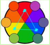
Split Complementary – a split complementary scheme is a combination of complementary scheme and the analgous. The complementary colors plus the analogous side by side colors of the main complementary color (4 colors total). My preference when designing a website. It is harmonious and gives you the ability to accent and be very versatile.
Neutral – a neutral scheme is formed from shades of brown and gray. These colors are not part of a normal color wheel.
Accented Neutral – an accented neutral is a neutral scheme with an accent color from the color wheel.
While the color wheels above show primary colors and how they relate I have never used the primary colors as a starting point in a design. To a viewer it is too dramatic and eye-jarring. I always start with a secondary or tertiary color or a primary that has been muted and softer to the eye. Remember that your site has to work in the absence of color too. See how your site looks to someone who cannot see colors
Too many different colors are distracting. Use no more than 3 -5 different colors. Make one color be dominant, one or at the most two be the complementary colors and use the rest as accents only. To attract attention use the contrasting color. Repeat colors to give the sense of similarity (i.e. internal hyperlink green, external hyperlink blue) You can also use color for organizational purposes
(i.e. h1 heading – dark red, h2 heading – med red, h3-h6 heading – pink).
Color is also used for identity purposes. This is called branding. If you use a logo, use the colors associated with the brand in the site. Color association across your site, letterhead and business cards are all your business identity.
Depth of color in your web design is controlled by warm and cool color. Warm colors come forward and cool colors recede. Dark color is usually the first thing you see while light colors are secondary.
In my article on choosing colors for your website, there are several examples of websites. The Stemilt Creek Winery has brown and orange background colors with green and purple accent color on the top and bottom. All very earthy colors as you would expect from a business who specializes in vineyards and wine. Notice how warm and inviting this site looks. The purple grapes at the top give it an elegant feel (as does the color of wine!). Green has a nature feel to it and blue has a business feel. It is all about what kind of mood you want to convey with your web site. Plan a color scheme at the beginning of your site design and think about what you want the visitor to think before they ever step inside the site. Remember that color is also a cultural phenomenon and plan on who is most likely to visit your site. The meaning of white in the western world is totally different than in eastern culture.
This is a color wheel with primary, secondary and tertiary colors. Primary colors are red, yellow and blue. Secondary colors are created when you mix two primary colors together. Red and yellow make orange, a secondary color. Blue and yellow make green. Blue and red make violet. Tertiary colors are made by mixing a secondary color and a primary color that are next to each other, together. Red (primary) and orange (secondary) make red-orange, a tertiary color. Have fun and check how many different color combinations there are. Then start changing the saturation and intensity of the colors. The possibilities are endless.
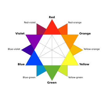
This image is from Wikimedia Commons. You can get a copy of it there.
Disclosure: Please read our privacy policy as it contain important information about using this site. Product Ads or endorsements are paid advertisements which help control costs.
Home | Expression Web Design Tutorials | Contact | Sitemap | Search