EW Design Tutorials

When choosing colors for your web page design you will want to think about how different web page backgrounds and color combinations might affect the person viewing your site. Colors can evoke different reactions in a person, a group or it can be of cultural significance. Color is the first thing that is noticed and sets the mood for your visitor. You don’t want the initial impression to be a bad one! This article is meant to give you an idea of what kind of emotional response a visitor might feel when you pick certain colors and how you can bring a visitor into your site (or push them away) just by the colors you pick.
Did you know McDonald’s picked red and yellow because red evokes a hunger response and yellow makes you want to leave. Fast food restaurants know this and McDonald’s acted on it. They want people to eat and run. Fast turnover of customers is key to their business.
Color means different things and there is no color that has a universal meaning. Some colors symbolize global meaning like red means stop in most countries. But red means a lot of other things too. It is associated with strength, power, fire, blood, war and also passion, love, desire, intensity. It is also a highly visible color.
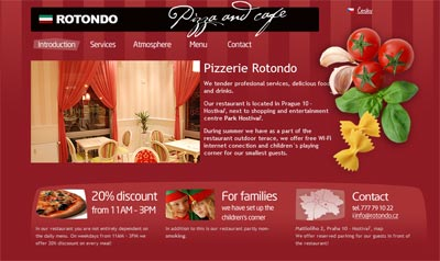
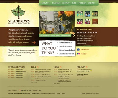
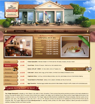
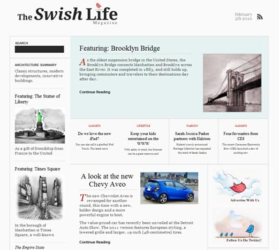
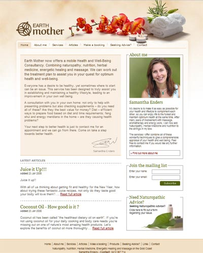
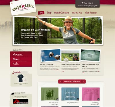
This article has to do with primary and secondary hues and how they can influence someone visiting your site. The images below are just examples of sites I have viewed that have used these colors very well in their sites. These sites are the the property of their owners and do not represent anything I have designed.
Read this complementary article on how color schemes can set the mood for your design.
Warm Primary Colors
Warm Colors are associated with danger, fire, warmth, passion, energy, impulsiveness and happiness in the Western World. But they can evoke entirely different feelings in the Asian and European countries. Determine who your audience is before you make color decisions based on the description below
Red is a hot color. Think fire or love and passion. Red raises your blood pressure and makes you breathe harder. Red can be a sign of importance (STOP!). Red can be a very energetic design color, but can be overwhelming if used too much. That said, the darker shades can be powerful and elegant.
Yellow is the brightest and most invigorating of the warm colors. Yellow is sunshine, happiness or hope. Pale yellows give a calm feeling of happiness and golden yellows give a more antique look to a web page.
Cool Primary Colors
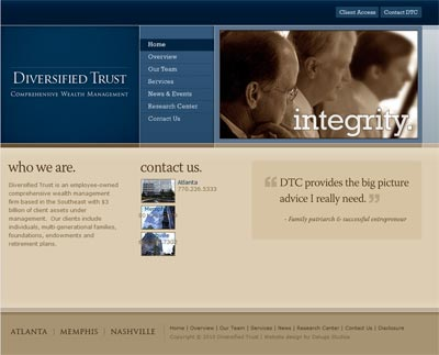
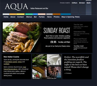
Blue is the only cool primary color. Dark blues are used in business sites often as it provides a sense of professionalism.
Secondary Colors
Orange is a mixture of red and yellow. It is also an energetic color. It can command attention without being overbearing. Muted oranges (think fall colors) are more of an inviting color.
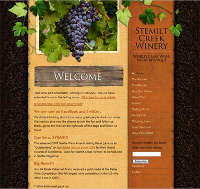
Green is a mixture of blue and yellow. It signifies growth and renewal as in nature. It can have the calming effect of blue and the energizing effect of yellow. Green has a way of balancing a page.

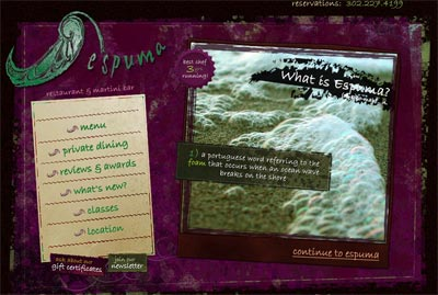
Purple is a secondary color of blue and red. Purple is associated with royalty, elegance and wealth. The more muted colors such as lavender can give a more romantic feel, while the reddish purples evoke both a rich and energetic feel to a website.
Neutral Colors
Neutral colors by definition have no characteristics of their own. They are used mostly for backgrounds and for making other colors to stand out.
Black is the strongest neutral color. It is associated with power, elegance and formality. It can also add an air of mystery to a website.
White is associated with purity and cleanliness. White allows other colors to stand out and is popular on minimalistic sites.
Gray or (grey) is a mixture of white and black. Gray can also have tones of reds, blues or yellows in it. Pure grays give a modern, subdued and quiet feel to a design.

Brown is considered a neutral color. Brown is usually used as a background or textural color associated with earth and wood. Brown can give a feeling of warmth and can be a good replacement for black.

Beige can take on the warm or cool tones of a web page. It is a mixture of brown and white. Beige tends to reflect the colors around it and is primarily used as a background color.
Cream and Ivory are quiet colors that lend a feel of sophistication. It can be used to lighten areas where darker colors are used without the stark contrast white has.
Disclosure: Please read our privacy policy as it contain important information about using this site. Product Ads or endorsements are paid advertisements which help control costs.
Home | Expression Web Design Tutorials | Contact | Sitemap | Search