
EW Design Tutorials
Concept of Good Web Design
The concepts of good web page design are everywhere. So are the bad ones. Here are some of the concepts you should consider when you want to design a website yourself.
General Good Web Design Concepts:
Pages download quickly. Lots of images, animation and javascript increase load time. If your viewer has bandwidth limits it can even cost them money.
Web page design fits the browser window of the most popular monitor sizes (1024×768 and 1280×1024 at this time). Design your site using 960px width and you will keep the majority of your users from horizonal scrolling (left to right), but on a wider monitor still fills most of the screen. With more users using mobile phones, you may want to consider a separate stylesheet or web site for them to use.
Grab the viewer’s attention at the top of the page before they have to scroll down, especially if you have a younger audience. Don’t make them wait for something to catch their attention or you might lose them.
Use graphics or images to break up the page. Long lines of text with no interruption can make a site monotonous very quickly. It also make the text harder to read.
Whitespace is good in a website. Pages that have content stacked on content and ads in every inch of space gives a cluttered look to your site and also makes it hard to read.
Page length – Don’t make pages too long. If the viewer has to page down 20 times to find what they are looking for they might just leave instead.
Design and color – Both are carried on throughout the site. Design with 2 or 3 major colors and no more than 2 other colors for accent. Read my article on website colors and how to choose a color scheme. Fonts – If you must use more than 1 style of font (serif, sans serif, grunge, handwritten), don’t mix and match within different elements. Serif fonts are great for logos and headline text but are harder to read when used in smaller print on the web. Sans-serif is great for all text. Handwriting fonts are great for logos and large text, but not for small text – use for accenting only. Use font stacks that degrade to web-safe fonts. Just because you have that gorgeous “no one else has it on their site” font on your computer doesn’t mean I have it on mine. Unless you are using a font that is served from your server or the web, your viewer will see what their browser defaults to. You can specify what that web-safe default font will be. Need a custom font? See my page on custom fonts that I can install for you.
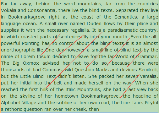
Content Text – Content is the most important item in your site. The text should be big enough to read but not huge (12 – 14 pixels is about right). It should flow from the most important content to the least important content, using headings like an outline for each new item. Content text should be 15 to 20 words per line for easy reading. Don’t use text justification to make your text line up on the right and left. After several lines in a paragraph you get “a river runs through it” effect.
Navigation Menus – Make sure that navigation buttons are easy to use and that they are the same design and in the same place in every page of your site. Users expect site navigation to be in the same area on every page. Make a sitemap if you have more than 1 level of links.
Other Links – Use one color and style for internal text or button links and an entirely different color for links that lead to another web site. Be sure that text links are a different style than your regular text so that the viewer knows immediately that “this text is different, it does something”. Make text that displays a pop up of information a different color also. Using underlines is also a popular way to show that “this is a link”.
Graphics – With more users having access to broadband internet, it is becoming increasingly common for web designers to go with large background images. Design with your target audience in mind. If you are selling graphic intensive software, chances are your audience has the latest and greatest technology available. If you are selling consignment iems – chances are your audience still has dial-up inernet.
Seven Questions to Ask Yourself before you decide to build Your Web Site
- What am I looking for in my site? Is your site going to sell something or is it an information only site? If you are selling something, how is the viewer going to buy and pay for the product? Push a button and add it to a cart, or is he going to fill in a form and submit it to you by mail or is he going to call you? If it is information, how is the information going to look on your site? 2 columns? 3 columns? Small square boxes with a summary and a link to a full page of detailed information or 1 full page for each navigation link?
- Who am I trying to attract to my site? What age group am I trying sell my product or information to? Teenagers, young adults (under 21), Adults less than 35, adults less than 50, adults over 50 or am I trying to attract them all?
- What colors do I want to include? If you already have an established logo you already know. If you don’t have a logo you may want to invest some research time into what colors mean to people of different colors. READ MY ARTICLE ON CHOOSING COLORS FOR A WEBSITE. I have listed some general colors and what they mean to viewers here in the United States.
- Green – a versatile color related to nature and healthy food. Used in landscaping and healthy food sites. This is a great color for the over 35 crowd.Blue – a calming more traditionally professional color. Used in banks, medical and professional business sites. Goes well with tans and browns.Yellow, Orange and Red – loud, attention getting colors. Used for sites that cater to the younger, more energetic crowd and can be used for “attention-getting” buttons. Toned down shades of these colors such as burgandy, brown and deep golden hues can be used on more traditional sites for the 35+ crowds that want a more elegant feel. Think restaurants and real estate sites.
- Who is your competition? What does their design say when you look at it? What do you like about it? What do you hate?
- Where is your main navigation going to be? What about your “other” links on the page? How is a visitor going to know where additional links are after the first page?
- Navigation links should be in the same place on every page. Other links should look the same throughout the site whether they are buttons or text links. If a “BUY ME” button is round and yellow on the first page that’s the way it should look like on the last page too. Same with “MORE INFO” buttons. They can be a different color and shape than the “buy me” button but whatever action the button is – stay with that color and shape. Then the viewer knows what to expect when they click that button. Which leads to another tidbit. Skip the “click me and click here” wording that gives no indication of what happens when they “click here”. Call-to-action buttons should say what they mean. “BUY NOW” means when you click this button you are going to buy this.
- External text links should all be the same color and font. Internal text links should all be the same color and font, but different from the external links. Popup information windows should be another link color. Consider underlining links for more visibility. While I am on the subject of links – animated links and buttons are so annoying. Use animation only as a subtle change – such as the transitions you see when you hover over something and you want your visitor to know that there is something else there to see. Keep in mind who your audience is.
- If you are using images for links, will they still know the link is there if your visitor has images turned off? What about any javascript that renders content? Will the visitor know they are missing something if the javascript doesn’t work or the visitor has it turned off?
- Build your site to work and be useable without all the fancy stuff and then add the pretty gadgets afterwards.
Questions to ask yourself after you have decided how your website will be built
- Is this what I really wanted my site to look like?
- Can I get rid of some of the clutter? Here is where most peop designing their own site fail. Too much on one page. You don’t have to have every inch of space filled. Space in a website is important and makes a web site more readable and user friendly. If you are selling a variety of items – put all items that are alike on one page. If you have 100 different kinds of shirts, make more pages and separate the shirts into sub-areas. T-Shirts, long sleeve shirts, short sleeve shirts, etc. Give the visitor a choice in which kind of shirt they want to look at. The same goes for an information site. Put all information related to one subject on each page.
**Example:- Monday – Ballpark opening today The new ball ballpark is opening in our town today
- Tuesday – Joe Smith is visiting today
- Do all my colors work together? Is there enough contrast so that my text is easy to read? Are my colors harmonious or do they clash. Remember your target audience.
- Have I created the design that I really wanted?
- Have I made it user friendly?
It is much easier to figure out all these questions before you actually begin to make your site and put it on the web. Changing a website design is much harder than building it from scratch. A little bit of forethought will go a long way towards getting your web site the way you actually wanted it.
Did you like this article? Use my feedback form and let me know.
Disclosure: Please read our privacy policy as it contain important information about using this site. Product Ads or endorsements are paid advertisements which help control costs.





Home | Expression Web Design Tutorials | Contact | Sitemap | Search